In-Page Push Ads: How They Work and Where the Rules Are in 2026
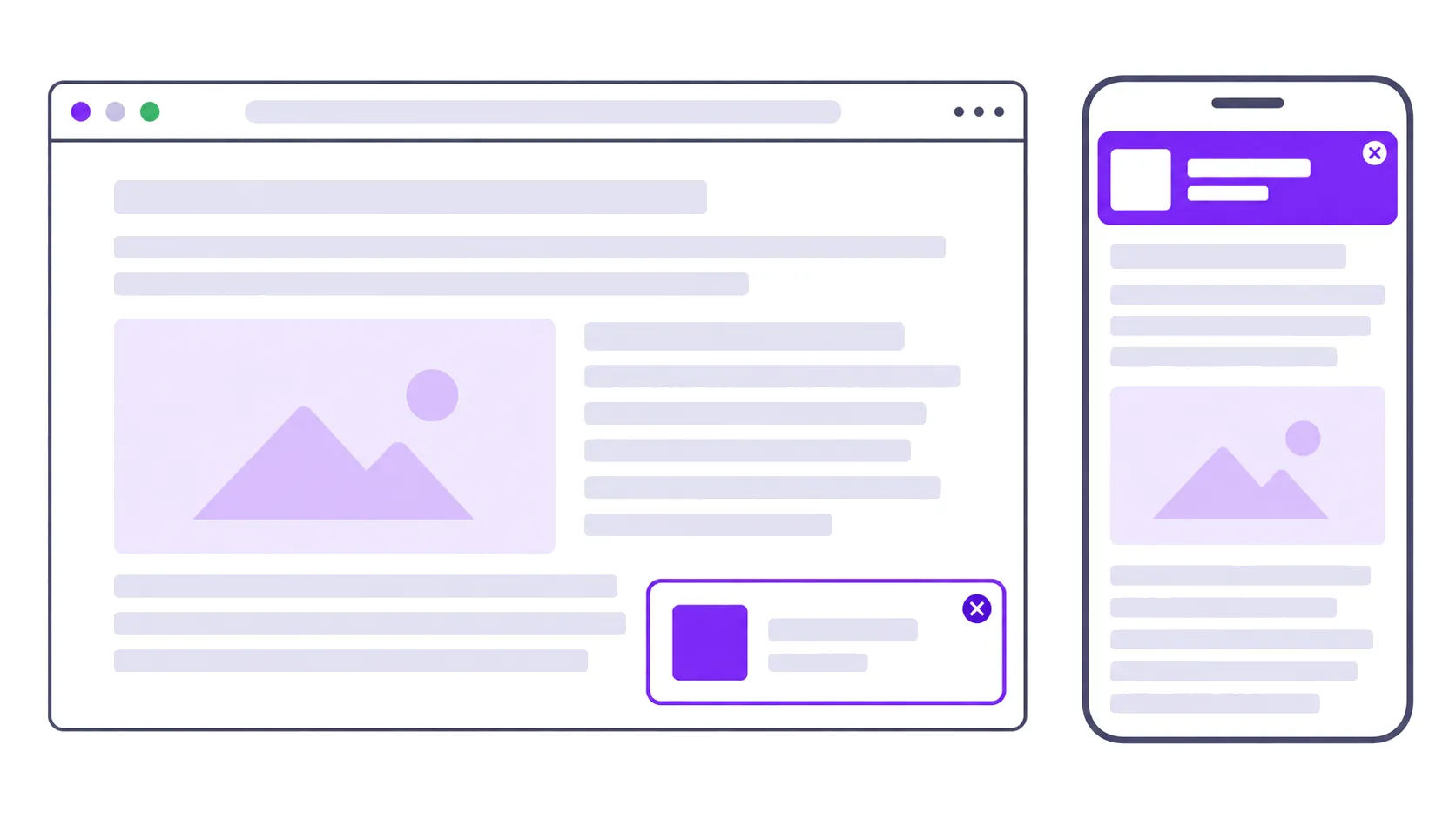
An in-page push ad is a small card that slides into the corner of a web page. It has a thumbnail, a headline and a line of text, and it looks like the notifications people get on their phones. Click it and you land on the advertiser’s page.
The important word is “in-page”. A web push notification is delivered by the browser to people who agreed to receive notifications from a site. An in-page push ad is part of the page itself, drawn by a script the publisher adds, so it needs no permission and reaches everyone who opens the page.
Why the format exists
Classic web push depends on a subscriber list, and browsers have spent six years shrinking those lists.
Chrome 80, in early 2020, introduced a quieter permission prompt for people who usually decline notifications and for sites whose requests are usually declined. In October 2025 Google went further: Chrome on desktop and Android now removes notification permission automatically from sites that send a lot of notifications to people who rarely engage with them. Google’s own figure is that fewer than 1% of notifications get any interaction.
On iPhones the list never really existed. Apple added web push in iOS 16.4, but only for web apps a user has added to the Home Screen. Someone reading your site in Safari cannot subscribe.
In-page push sidesteps all of that. It borrows the look of a notification and none of the permission system.
In-page push compared with web push
| Web push | In-page push | |
|---|---|---|
| Needs the visitor to opt in | Yes | No |
| Where it appears | Operating system or browser notification area | Inside the web page |
| Reaches iPhone users in Safari | No | Yes |
| Shown when the visitor is not on your site | Yes | No |
| Affected by Chrome permission revocation | Yes | No |
| Counts as an ad on your page for policy purposes | No | Yes |
That last row is the one publishers forget, and it is the subject of the section after next.
What it looks like in practice
Most implementations follow the same pattern. The card is small, pinned to one corner, and replaced on a timer.
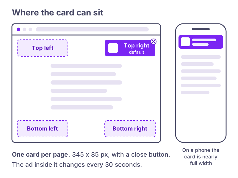
Our own floating unit at PurpleAds is a 345 by 85 pixel card. You choose one of the four corners in the dashboard (top right is the default), and the ad in it rotates every 30 seconds. Monetag’s version defaults to the upper right on desktop and the top of the screen on mobile, with the position adjustable.
Because the card stays on screen while the visitor scrolls, it is hard to miss. That is the main commercial argument for it: a leaderboard at the top of a long article is seen once and scrolled past, while a sticky corner card stays in view for the whole visit.
The policy question
Google lists “fake messages” among the abusive experiences Chrome enforces against, and defines them as ads or other elements “that resemble chat apps, warnings, system dialogs, or other notifications that lead to an ad or landing page when clicked.” An in-page push card is designed to resemble a notification. Whether a particular ad crosses the line depends on the creative: a card with a clear product image and headline is an ad in a sticky slot, while a card showing a fake unread message count, a missed-call icon or “You have 1 new message” is exactly what the policy describes.
The consequence is not small. If your site fails the Abusive Experience Report in Search Console and you don’t fix it, Chrome first blocks new windows and tabs from opening, and after 30 days in failing status it removes all ads on the site, including ads that had nothing to do with the problem. Google emails registered site owners at least 30 days before enforcement starts.
The Coalition for Better Ads is the other rulebook. It fails large sticky ads on mobile, defined as sticky ads covering more than 30% of the screen. A notification-sized card is well under that, but stacking it on top of a sticky anchor banner and a sticky video player is how pages drift over.
In practice that means four checks:
- Verify the site in Search Console and look at the Abusive Experience and Ad Experience reports every few weeks.
- Look at the ads your network actually serves, on a phone, from a few different countries if you can. Chat-style creatives with fake badges are a reason to block that advertiser or change network.
- Keep a working close button on the card.
- Count every sticky element on a mobile page together, not one at a time.
Networks that sell in-page push to publishers
The format comes from the performance advertising world rather than from premium display, so the networks offering it are mostly the ones that also run popunders, push and direct links.
- PurpleAds (that’s us) runs it as the floating unit alongside responsive display banners and sticky placements, with no traffic minimum and payouts from $20 through PayPal.
- Monetag sells it as the “In-Page Push (Banner)” zone type, added with a script below the head tag.
- Adsterra packages it into Social Bar, a single code that rotates in-page push, interstitial, icon notification and widget creatives.
- HilltopAds offers separate desktop and mobile in-page formats, paid on CPM or CPC.
None of these publishes a standard rate for the format, and anyone quoting you a universal in-page push CPM is guessing. Rates depend heavily on where your visitors are, and the only number that means anything is the one your own traffic produces.
Setting it up
With PurpleAds the order is: add and verify your site, then add the floating ad code to the <head> of your pages, directly or through the WordPress plugin or Google Tag Manager. You can show one floating card per page and still run responsive display banners in your content, as long as the page doesn’t end up with more than five to eight ads at once.
In-page push also doesn’t replace AdSense. If AdSense is your main network, the card sits in a corner AdSense isn’t using, and the two run side by side.
How to tell if it’s working
Measure revenue per session, not revenue per ad. A corner card adds impressions to every page view, so ad revenue almost always rises. The question is whether it costs you something elsewhere.
Compare two or three weeks before and after on the numbers the card could hurt: pages per session, time on page and returning visitors. If revenue per session goes up and those hold, keep it. If pages per session drops, try a bottom corner instead of a top one before giving up on the format, because the card at the top of a phone screen sits right where people read. Our guide to publisher metrics covers which of those numbers to trust.