Heat maps are a powerful tracking tool that can help website owners understand how people interact with the content on their website. It’s extremely useful for affiliates, publishers, and sellers that want to increase conversion rates.
It is different from other analytics and measuring tools because it reflects not only the number of visits, visitors, duration of a visitor’s visit, etc, but also focuses on user experience.
As we have previously discussed in this blog, user experience is vital for monetization success and should be the number one priority when optimizing your website. Heat maps can be very helpful in this process.
In this article, we’ll discuss what are heat maps, how they work, how to use them successfully, and which are our picks for the top heat map tools on the market today.
What are heat maps?
Heat maps are a type of tracking tool. It is a visual overlay of a specific page, that has the appearance of an infrared display with color variations indicating high and low levels of activity.
It provides information about the onsite activity and behavior of the visitors on your particular website in the form of clustered multi-colored dots or a gradient.
With the help of heat maps, business organizations, affiliates and publishers can get a fair idea about the areas that are most visited, clicked, and liked by their site visitors.
Why should you use heat maps?
If you are not aware of the onsite activity and behavior of your site visitors, you will not be able to analyze how your website design, home page, site elements, navigation features, or other such components affect your user experience.
Neglecting such elements will make your website under-utilized and will affect your conversion rates and product sales greatly.
Using an easy-to-understand, intuitive design, heat maps will help you:
- Optimize the placements of important page elements for affiliates and publishers – ads, CTA buttons, sign-up forms, and more.
- Understand why your visitors are not converting.
- Realize which elements help drive conversions and which are ignored, or even sabotaging.
- See which areas of your webpages are most loved and which areas aren’t ever reached.
- Understand why some pages get a high bounce rate.
No matter which type(s) of heat map you may choose to use, it will enable you to use actual data to understand reader behavior and how to make your website more useful overall.
Types of heat maps
Click and Taps
A type of heat map that allows you to see where your visitors are clicking (or tapping, on mobile devices). By showing which areas were most clicked on, this heat map can indicate what interests or confuses visitors – you can learn lots about users’ intent.

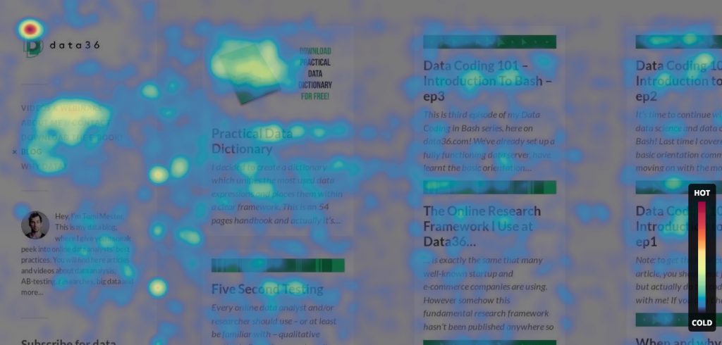
Hover and Movement
A type of heat map tracks the movements of the mouse and where users focus their attention most by hovering the cursor. This heat map can give a good indication of the way people take in your content.
Scroll
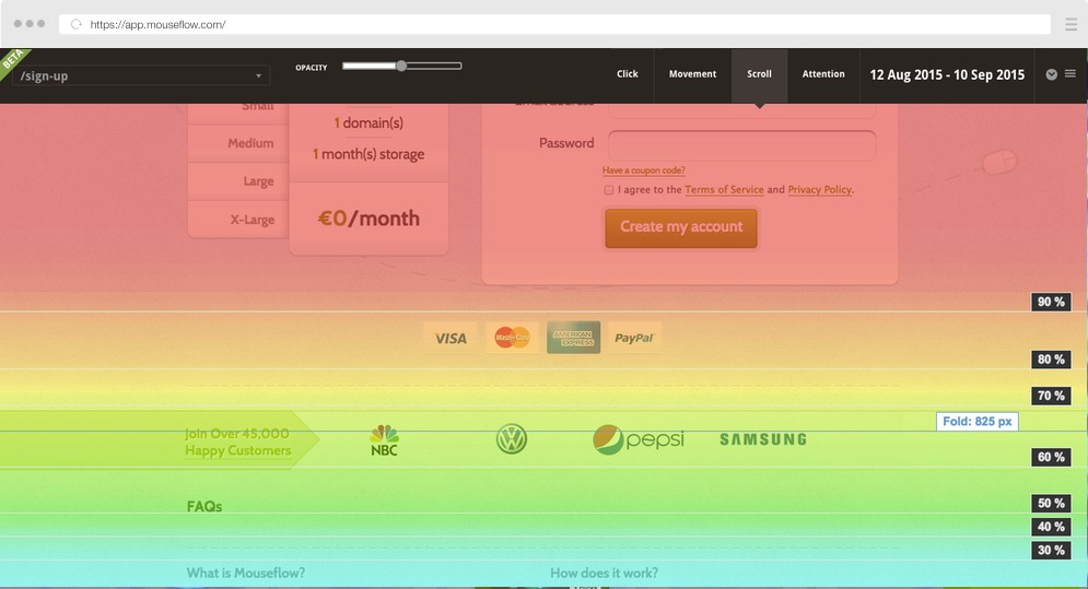
A type of heat map that tells you how far down visitors are scrolling before they stop. It shows the percentage of total page visitors that have reached each section of your page. It can indicate where people abandon your page and give insight into the layout of your page.
Screen Recordings
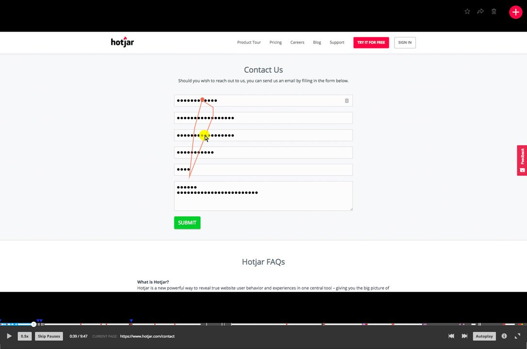
Screen recordings are not presented in a heat map form, but they are a type of user tracking nonetheless. These are literal recordings of each user’s session and show how people actively interact with your page. Recorded user sessions are completely anonymous, so there isn’t a need to inform your visitors of them.
Bonus – Eye Tracking
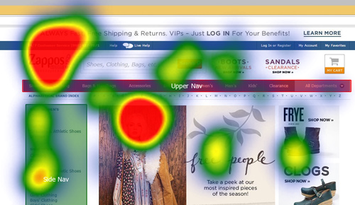
This is a special type of heat map. Users’ eye movement is tracked via webcam or special glasses, which requires users to actively and knowingly participate in the test. Data is gathered on how many times a visitor looks at individual elements and on visitors’ fixation length, and the heat map visualizes the most attention-grabbing areas in your webpage.
How to use heat maps to improve content performance
By now, you’ve realized heat maps are wonderful in helping you gain insight into the users’ experience on your website. But they can also be quite confusing.
If you go in blindly and start setting up different types of heat maps without knowing what you’re looking for, you can get lost in all of the data pretty fast.
This is why it’s extremely important to use heat maps combined with other analytics tools, as part of your optimizing process. Without data from analytics tools, you may apply your own biases or misconceptions when trying to interpret the heat maps.
However, when used along with other analytical tools, heat map tracking tools can give good results for optimizing a website, understanding the collective behavior of website visitors on content, generating content performance, and driving higher conversion rates.
It might sound a bit confusing, that’s why I’ve listed below the 5 steps you need to follow to successfully and easily incorporate heat maps into your website’s analysis and optimization process.
1. Use analytics tools
The first step is to look at your analytics tool of choice and find the pain points within your funnel. This could be a page that has a high bounce rate, a page that doesn’t converse as well as you expected, slow pages.
When you’re done, you’ll have a list of all the pages you want to optimize.
2. Hypothesize
Next, start asking yourself questions. Try to speculate what could be the reason each page is not performing well. The questions could be:
- Is the CTA button placed in an easy-to-see, prominent area of the page?
- Are there too many ads on the page?
- Are visitors given all of the relevant information they need to convert?
- Were visitors expecting that there would be a different type of content on this page?
The list of possibilities is endless, but you as the website owner will be able to make the most educated guesses.
3. Create heat maps
Set up the different types of heat maps (and optionally screen recordings) of the problematic pages you have found.
4. Analyze heat maps data
Analyze the data according to the questions you’ve asked. Try to answer the questions according to the heat maps and come up with possible answers.
There are many meaningful insights you can gather from analyzing your heat maps. Some common, effective ones include:
- People are clicking on elements that aren’t clickable.
This is extremely easy to find from the click and tap type of heat maps. Often certain elements or images on a webpage are designed in a way that makes them look clickable, like buttons, despite not being.
If people are clicking on these elements, that might mean you need to change the design of them.
Also, make sure to understand what the users’ intent was by clicking on them because evidently, people want to reach content represented by these elements. Perhaps you’ll get new content ideas.
- Identify the content people are most interested in.
You can use the movement map to see which part of the page has been viewed the most, which has been the most engagement. This will help you understand which areas of your content people care about most.
One takeaway from this insight will be to change the locations of your ads of CTA buttons so they’ll be closer to the main area of interest and consequently might get higher CTR.
- Find out where you’re losing visitor attention.
Scroll maps can help you locate big drop-offs on a page. Seeing which areas of your page get visitors to exit can either tell you that the information the visitor has gotten this far into the page wasn’t relevant, or that by that point into the page the visitor has gotten all of the information he came for.
If you have important CTAs, products, content, or ads in an area which not many people get to, you may want to move it to a different, more visible location.
5. Compare with other analytic tools
Then, start comparing the data you got from the heat maps with the data you have from other sources of research. For example surveys, analytics, user testing, interviews, etc.
Check for correlations between the different research tools, instead of drawing conclusions from just one.
After deciding what is most likely the cause of your issue, apply the necessary changes and test for some time to see if there is a change in customers’ behavior.
Best Heat maps tools
MouseFlow
Best value
MouseFlow uses click, hover, and scroll heatmaps as well as screen recording to show the activity of users on your website. It describes itself as an “all-in-one analytics tool”, offering features like conversion funnels, reporting and forms, and polling to collect feedback from customers.
MouseFlow offers a free forever plan basic plan. The paid plans are quite budget-friendly, starting at $24 a month.
Hotjar
Best for beginners
Hotjar is a behavior analytics and user feedback service that helps you understand the behavior of your website users and get their feedback through tools such as click, hover, and scroll heatmaps, session recordings, and surveys. It also allows you to split traffic by device type.
Hotjar offers a free basic plan. Other plans start at $39 and offer more advanced features.
Lucky Orange
Best for experimenters
Lucky Orange differs from other heat map tools by allowing you to record and track user sessions in real-time, so you can see the heat map in action while visitors are on the page. It can help track hovers, scrolls, and clicks. It has more advanced features as well, like session recordings and conversion funnel monitoring.
Lucky Orange offers a 7-day free trial and subscription plans start at $10 a month.
CrazyEgg
Best for advanced
CrazyEgg is an online application that provides you with eye-tracking tools such as hovers, scrolls, and clicks heat maps, as well as other feathers like a confetti map and user recording to track a website’s operation. It easily integrates with other analytics tools and features A/B testing.
CrazyEgg offers a free 30-day trial as well as paid plans starting at $24 a month.
Clicktale
Best multi-solution
Clicktale is a Saas, cloud-based analytic system and service that allows you to visualize your customer’s experience on your website from their perspective. It provides the ability to analyze their interactions in aggregate in the form of heatmaps and reports, as well as individual session replays.
It is offered as a part of Contentsquare, a Digital Experience Analytics Platform. Contentsquare’s pricing model is based on the monthly number of pageviews on your site or sessions in your mobile app., and you can book a demo to get started.
Conclusion
Using heat maps can and should be an important step in your CRO (conversion rate optimization) strategy.
Whether you want to get your visitors to click on your affiliate links, ads, or purchase your products, analyzing their behavior on your site with heat maps can give you some incredible insight.
A simple heat map lets you see if visitors are clicking on your conversion elements, and if not, what they’re clicking on instead.
With so many tools available on the market, there really is no reason to not give heat maps a try.

