Display advertising is a great way for publishers of any kind to monetize their websites. The amount of money your website generates from displaying ads depends on multiple factors, such as ad size, placement, and traffic quality.
All of these factors, and more, can be optimized to guarantee you are making the maximum amount of revenue possible for your website.
Ad optimization doesn’t have to be complicated! A couple of tweaks and changes for your already existing ad inventory can make a great difference.
If you want to learn more about display ad optimization – keep on reading.
Top Optimization Tips To Make More Revenue From Display Advertising
Don’t place too many ads
Don’t assume that just adding more ads will lead to higher revenue. The most important thing to a publisher should be user experience. If your visitors decide that they don’t like their time on your website, they’re unlikely to come back.
That’s why placing too many ads on your web pages should be avoided, it can decrease the effectiveness of all present ads, lower your CTR, and turn people away from your content.
The layout of your pages and the length of your article will determine the number of ads to be displayed. Try not to put more than 5-6 ads on pages with short content as this will result in a high bounce rate. For longer pages, the ad number can be increased.
Another point to consider when deciding how many ad units to place on a single page is the origin of your visitors. According to a study by Ezoic, visitors that reach content organically (through search engines), have a lower tolerance to ads.
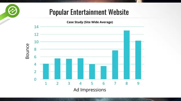
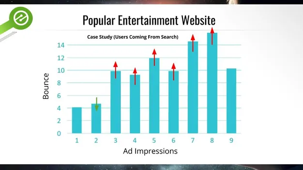
As you can see, the bounce rate was dramatically impacted after 2 ad impressions. This means that while generally, 5-6 ads are the recommended number of ads, for organic search visitors, the number is actually 2 ads.
Consider different ad sizes
Experimenting with different ad sizes is key for ad optimization.
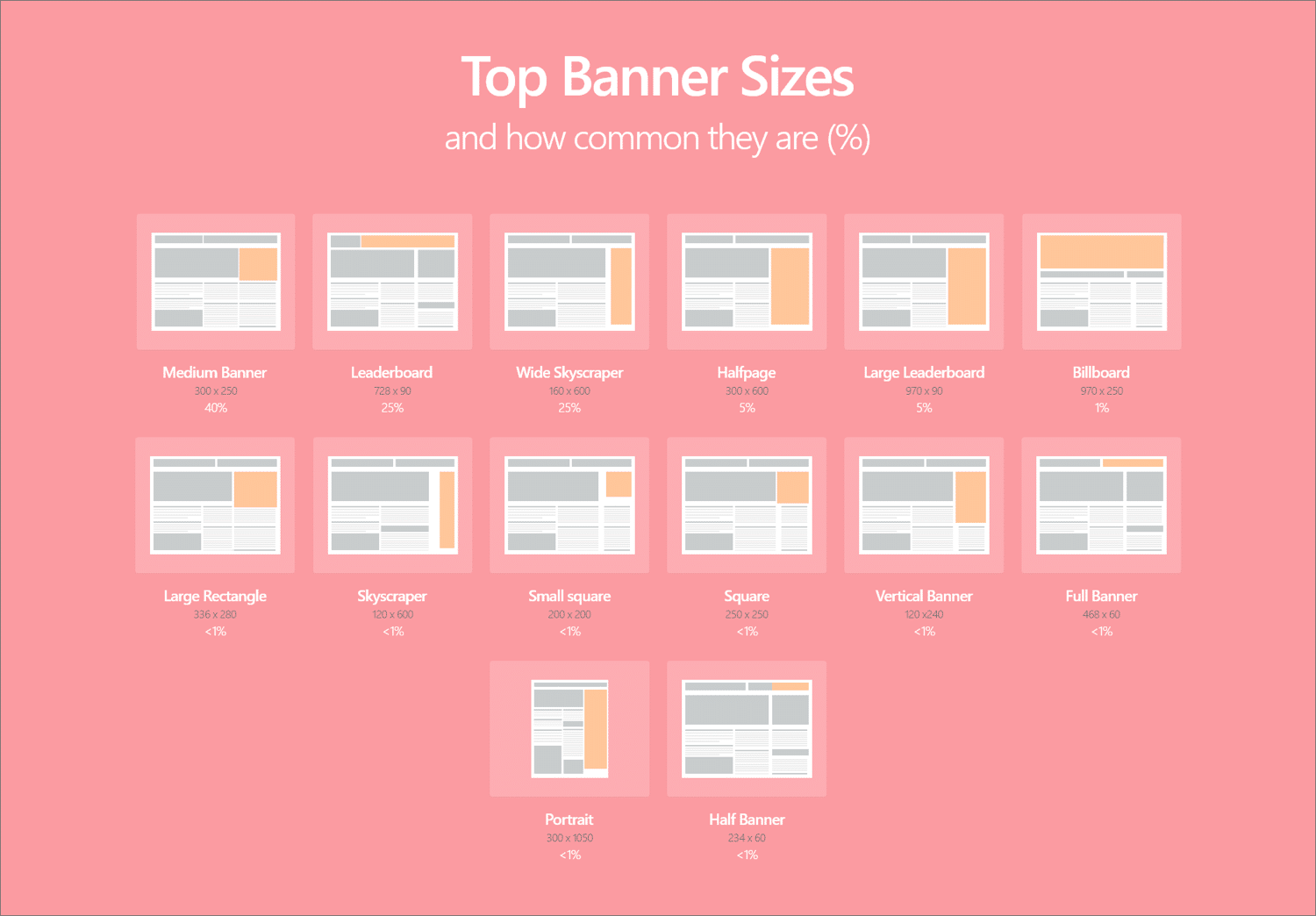
Usually, bigger ad units are better at catching users’ attention and getting them to engage. The medium rectangle (300×250), leaderboard (728×90), and wide skyscraper (160×600) are the top 3 most popular sizes – and for good reason! They are also some of the most high-earning for publishers.
However, depending on the layout of your website, different ad sizes may work best for you. To learn more about ad size and their performance, take a look at our Best Banner Sizes article.
Experiment with multiple types of ads
There are many different types of ads. As such, it may be a good idea to experiment with different formats and types of ads, other than the regular static banner ad.
An example of a new and highly engaging type of ad is the IPP – In-Page Push ad.
In-page push ads are a type of banner ads “dressed” as push notifications. In-page push ads are displayed directly on the publisher’s site, like banner ads. This gives them high-performance rates without any subscription limitations traditional push ads have.
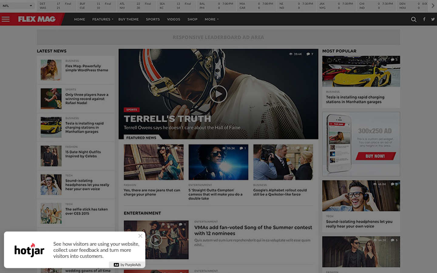
Many users already have banner ad blindness, after being used to see and ignore these types of ads, so this new design allows advertisers to capture the attention of users that are wary of banners.
PurpleAds is one of the companies that does provide publishers a way to create a new revenue stream by showing non-intrusive in-page push ads on your website, and also lets advertisers promote their website, product, or service to visitors worldwide using the same beautiful in-page push ads.
The same principle applies to other types of ads, like lightbox ads, popunder, video, and many more. So try experimenting with new and exciting types of ads, and see how your audience reacts.
Place ads above the fold
ATF (above the fold) in online advertising refers to the space that is first viewed when entering a webpage.
It is a term taken from print media. The ‘fold’ used to mean the literal fold in a newspaper, but on a computer has come to mean the bottom of a user’s screen before scrolling down.
As it is the first place users see, and because not every visitor will decide to scroll down your page, ads that are placed above the fold have much higher viewability than those placed beneath.
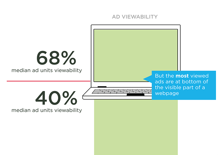
Higher viewability = higher CTR = more revenue for publishers. It’s that simple.
However make sure to keep in mind tip #1 and don’t place too many ads above the fold, as it can damage your user experience. Instead, when optimizing your ad placements, try to fit 2-3 ads ATF at most. Another pro tip is to place an ad right at the bottom of the visible part of the webpage. This location is found to be the most visible and captures 100% of revenue potential.
Optimize for all devices
Users are going to be accessing your site from different devices. Ideally, you’ll want to optimize the ad experience for visitors based on the device they’re using, but at the very least, you should make sure the ads you display look good and load well across all devices that bring traffic to your website.
Research shows that click-through rates and average eCPM (the ad revenue of a publisher per 1000 impressions) on mobile devices are significantly higher than on desktop.
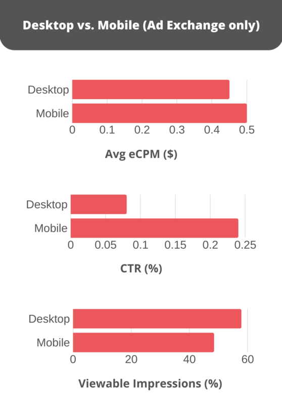
Having a mobile-friendly website and an optimized ad experience is essential when placing our ad units on your site to increase your eCPM. Make sure to put an effort into creating a positive mobile experience for users across different browsers, page speeds, and devices.
Counter adblocks
Roughly 25.8% of internet users are using some type of ad blocking on their connected devices, and as people get more and more fatigued from display ads, the number will keep going up.
Adblock tools lead to lost revenue for website owners. When a user with an adblock tool enabled visits a website, adblock prevents the website from loading ads. This means the publisher is denied the opportunity to gather clicks or impressions that generate revenue. The result is website owners cannot monetize these visits.
Therefore when performing ad optimization, it is important to consider different ways to counter adblocks. For example, anti-adblock tools enable website owners to show ads even if a user has an adblock tool enabled. This allows publishers to recover advertising revenue that would otherwise be lost because of adblock.
According to Techcrunch, 30.5% of the top 10k websites are already using at least one anti-adblock tool to combat lost revenue.
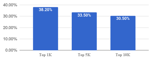
Try to look into what kind of anti-adblock tool would work best for your website. If you have a WordPress site, check out this list of recommended plugins.
A/B testing
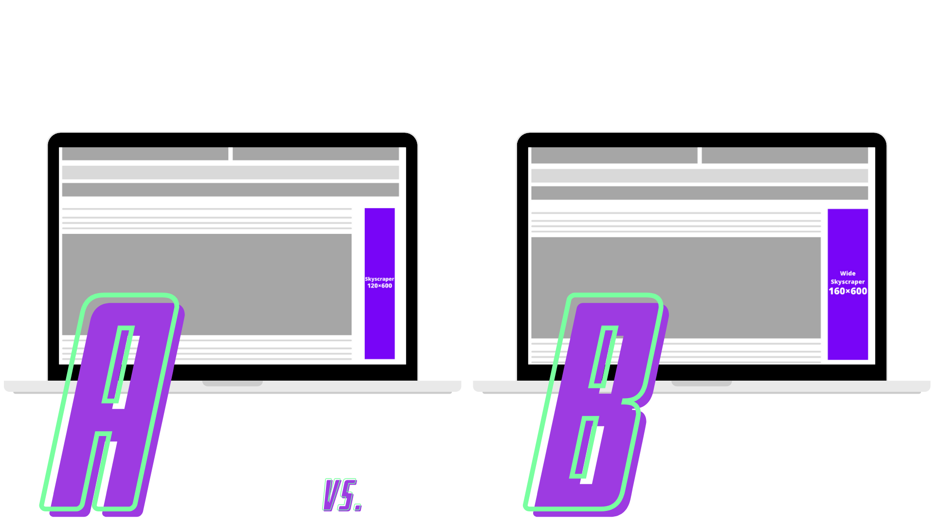
A/B testing is a test where you compare two versions of something side by side, to see which one gets better results. This is a powerful tool that can get you some hard evidence about which types of ads you should use, how many ads to display, in which locations, and how users interact with each page.
Start by collecting data on the performance of your current ad, then set a goal or a hypothesis – what do you think the result of this test will be? After that split your traffic and perform the a/b test. Make sure to let the testing run for enough time until you can be certain you’ve accumulated enough data. Finally, collect and measure the results, make adjustments, and repeat the process.
This way you can judge the value of an ad unit, and as a result, this advanced knowledge can drastically increase ad revenue.
Conclusion
Displaying ads can be as simple as signing up to any ad network and adding some ads to your webpages. However, such low efforts will most likely yield low results.
If you want to make sure you’re making the most out of your ad units, follow the ad optimization tips above and you should expect to see your ad revenue increase while providing a better user experience for your visitors.

