For years now, display advertising is one of the most common strategies publishers use to monetize their websites. It’s an easy way to create another stream of revenue, without too much effort.
Display ads are one of the most customizable forms of advertising. Most advertising networks give their advertisers and publishers many ad sizes to design and display on their websites.
There are so many possibilities, but which size is the best?
Different website banner dimensions and ad formats are best each at their department: while some increase ad impressions, the others achieve better CTR or an engaging user experience that works best for post-view conversions.
If you want to understand which ad sizes you should display on your websites, you’ve come to the right place.
Let’s get started.
Desktop banner ads are divided into 3 main categories: leaderboards, rectangles, and verticals.
Leaderboards generally go either at the very top, or very bottom of the screen, sometimes as a sticky ad, rectangles are embedded within text content or at the end of articles, and verticals fit at the left or right side of the webpage.
The following 10 banner sizes have been proven to be the most common ad sizes, by gaining the most impressions from online desktop users.
If you are looking to display banner ads to your website, including these ad sizes, the top 5 in particular, is a good place to start at.
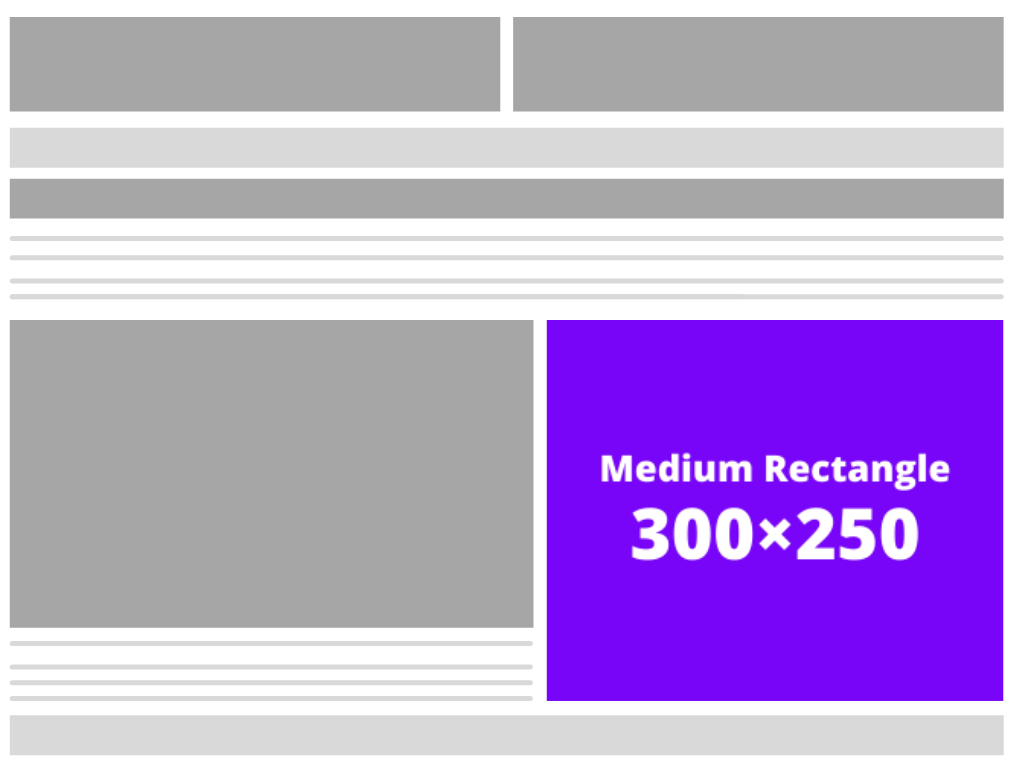
Medium rectangle (300×250)
This banner size has the biggest amount of impressions and is favored among most online businesses. It performs well if placed in the sidebar and between organic content, which means it could potentially attract a wider audience.
This standard banner has about 40% of the global ad inventory and is by far the most important ad size you can utilize on your website. The reason it’s so popular is that it works well on both mobile and desktop.
On the Google Display Network, which reaches 90% of global internet users, this image ad tends to have the largest supply of ad inventory. That means lots of opportunities and niches for publishers to display on their site.
Leaderboard (728×90)
The leaderboard banner is the second most common ad size among global inventory, with about 25% of global impressions.
Additionally, the leaderboard banner size is usually 728×90.
Its long horizontal width helps increase its impact on users and makes them more likely to click it. Due to its diameter, this size is best used for displaying logos, brand name, and text.
It’s one of the most common ad sizes and converts exceptionally well when located above the main content. The area is quite effective since the viewer’s focus is immediately drawn before reading the headlines or content.
The leaderboard ad could sometimes be found at the bottom of web pages as well. However, ads above the fold tend to have more impressions and deliver better results than ads at the bottom – simply because people rarely ever scroll to the bottom of a page, and when they do, they’re less likely to click on an ad considering they are done with the content.
Wide skyscraper (160×600)
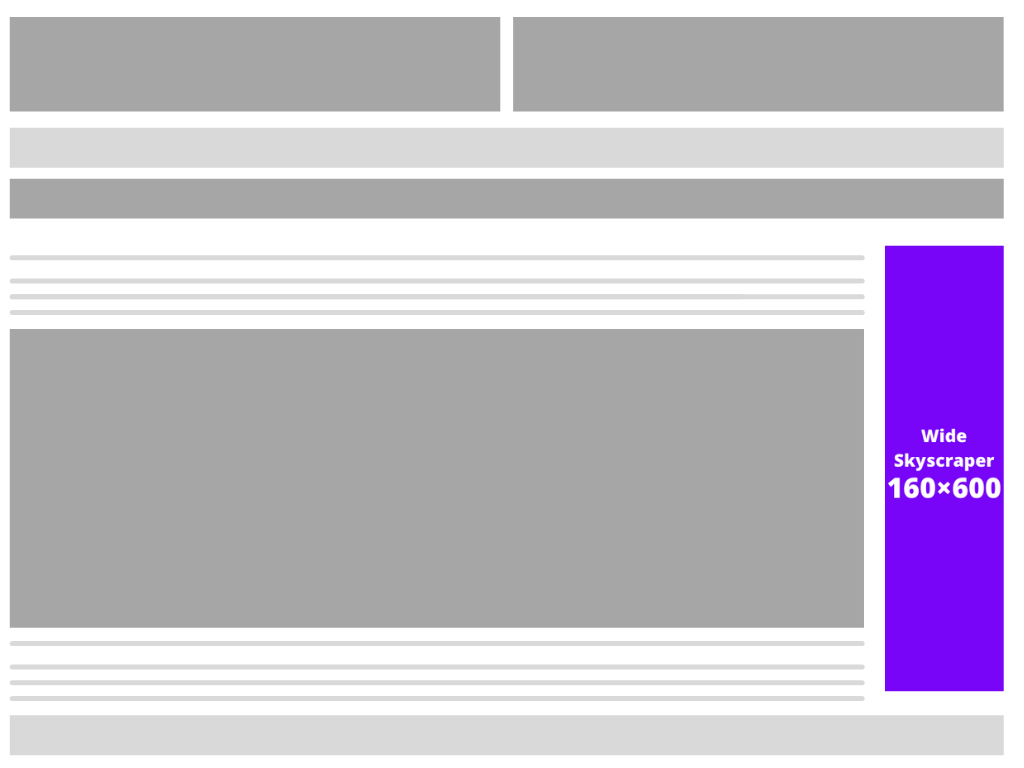
The wide skyscraper (also known as the standing skyscraper) is the third most popular banner size. This is the more common of the two Skyscraper banners with about 12% of global inventory.
The ad width offers a high impact on the page visitors. The Wide Skyscraper is usually used on the sidebars of websites and converts well both as text and imagery ads.
Half-page (300×600)
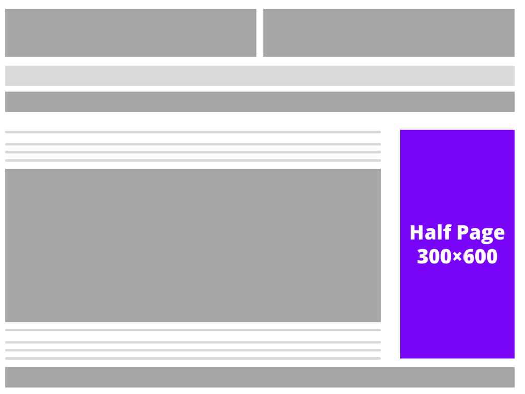
The half-page banner is one of the larger so-called premium ad sizes. It makes up only about 1% of ad impressions, however, it has a surprisingly strong growth rate.
Although half-page ads don’t take up half of the page as their name suggests, they perform well and richly communicate information to readers. Thanks to its large size and high visibility, viewers have to look at it for a longer period of time, which can encourage more clicks and conversions.
The half-page banner ad usually fits at the side of the web page.
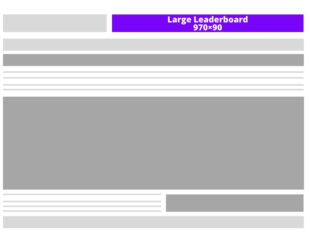
Large leaderboard (970×90)
A bigger version of the classic leaderboard banner ad, the large leaderboard lines the upper parts of websites too. The large size of this banner ad captures the reader’s attention, creating more engagement.
This ad also includes an option to expand, shifting the rest of the page’s content downward, which can create a distinct experience. This can generate even more interaction, but it can come across as invasive. However, users can continue interfacing with the expanded version, or they can simply move on.
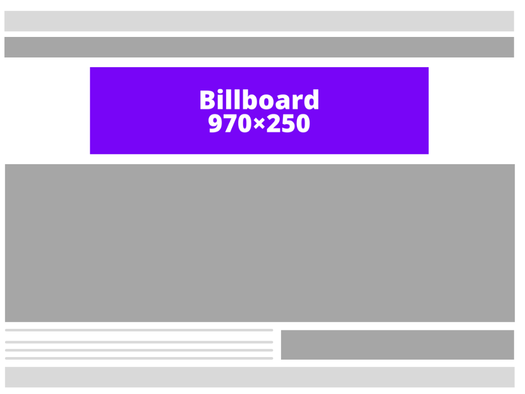
Billboard (970×250)
As the biggest horizontal ad size out of the popular banner ads, the billboard ad stands out at the top of pages. This banner ad can sit in different positions on websites, but they get the best impression rates when located above content.
Thanks to its large size, the billboard ad allows optimal text spacing for advertisers that need to display text-heavy ads.
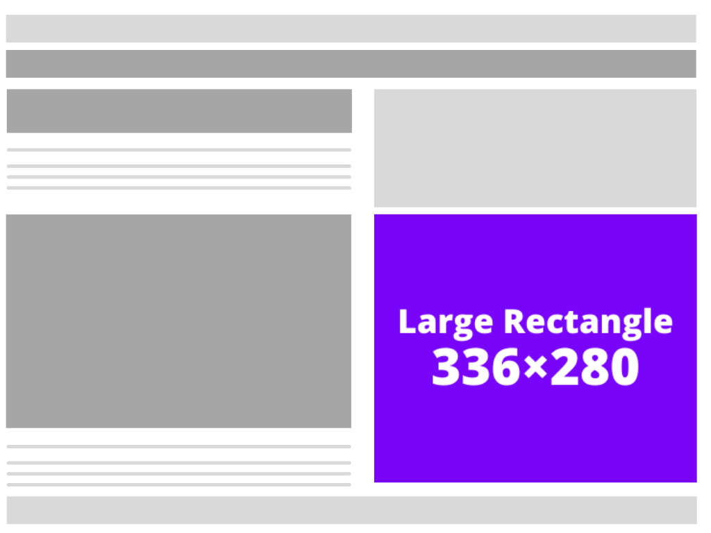
Large rectangle (336×280)
Similar to the medium rectangle, the large rectangle also has an abundant supply of ad inventory. Research has shown the larger ads catch the user’s attention more than small or medium ads, which consequently means it also gets a higher CTR. The large rectangle performs best when placed within an article or at the end of one.
Skyscraper (120×600)
Situated on the sides of pages, skyscrapers are tall ads, which restrict word placement. As the thinner version of the wide skyscraper, this banner size is aimed at websites that cannot accommodate the latter.
Vertical banner ads are generally less sought-after by businesses. However, skyscraper ads also still hold a fair chance of getting your audience to click on them, and if they’re engaging enough – even convert, so they’re worth considering.

Mobile leaderboard (320×50)
The 320×50 banner is by far the most widely used ad for mobile, both in browsers and in apps. According to Match2One shows that about 12% of all global ad inventory is made up of the Mobile Leaderboard.
However, this banner size is also extremely popular on desktop.
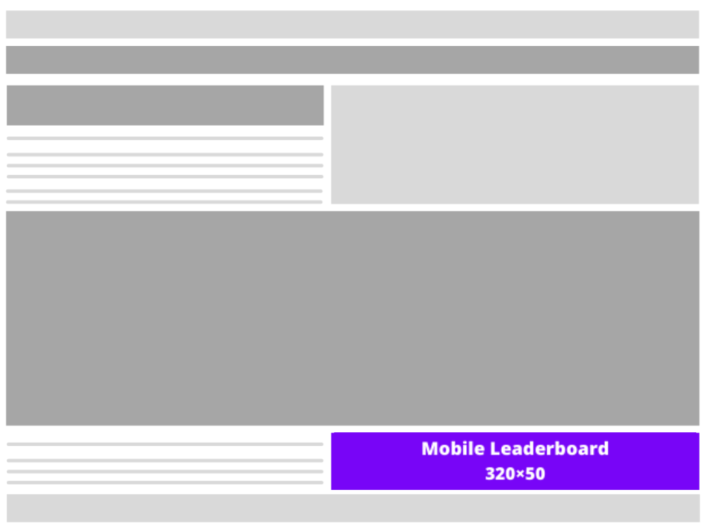
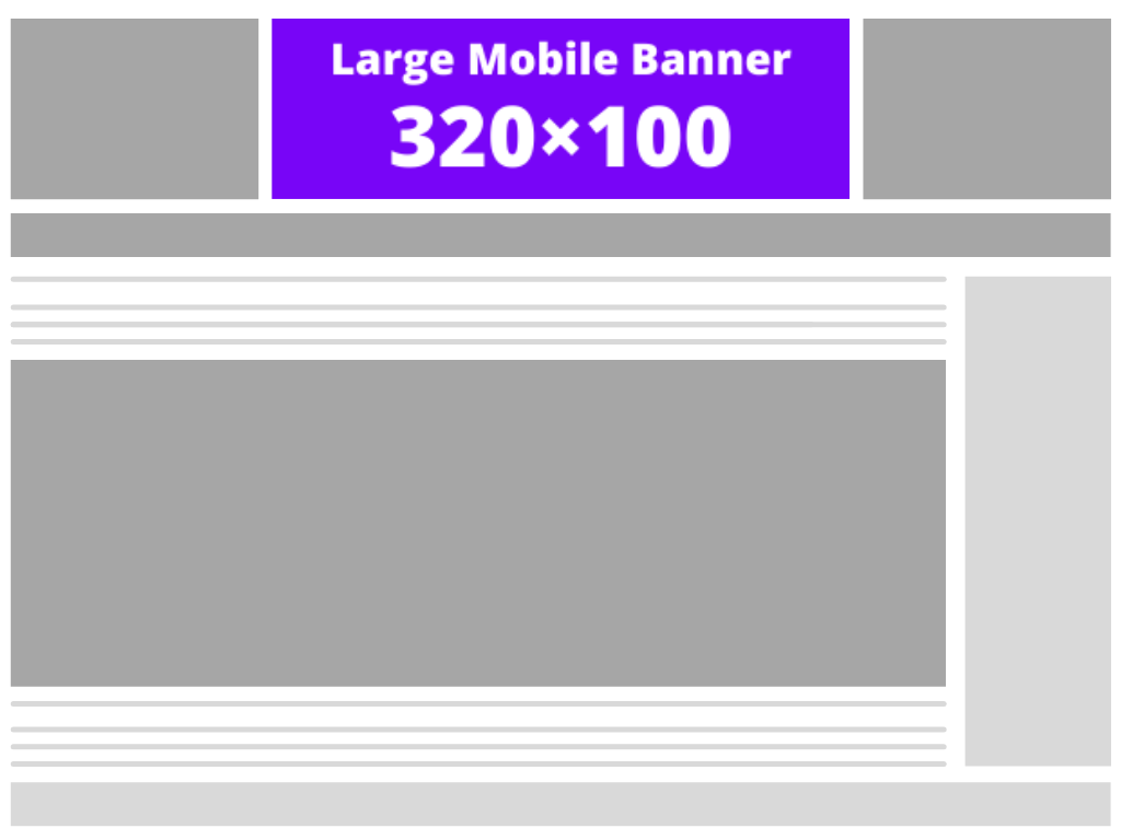
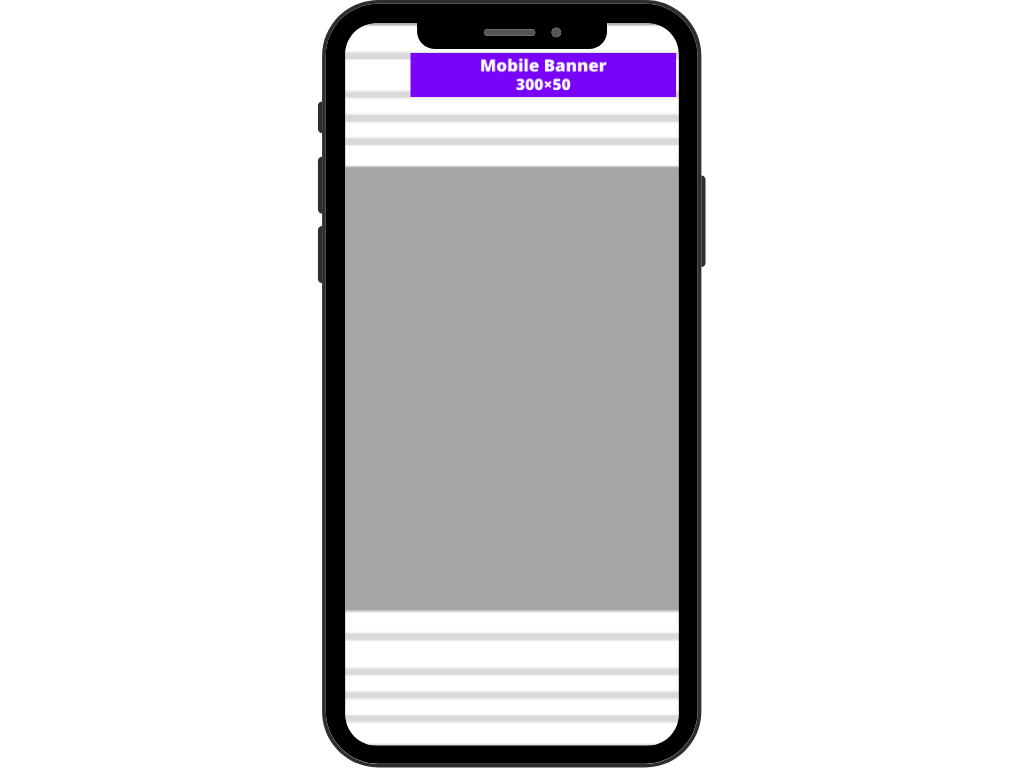
The large mobile banner is a mobile ad format that can also be used on desktop. It is an equivalent of the leaderboard ad format in terms of effectiveness but for mobile devices. Since mobile traffic makes up a good chunk of users for most websites, this ad format gets a better ad inventory.
Ideally, it works best when placed on top just below the header. This ad size generates a lot of engagement by providing twice the space as the standard mobile leaderboard.
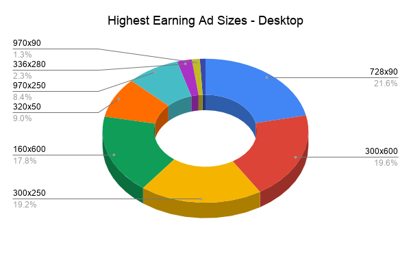
When it comes to desktop, the most popular banner ad sizes are rectangle and leaderboard banner sizes and also the highest-earning.
The leaderboard ad size gets the most revenue for publishers. It makes sense as publishers generally place it above the fold. Higher viewability, and the large size of this ad – grants it better CTR.
The half-page has achieved solid results because it provides advertisers with plenty of space. Larger the size, better the CTR, higher earnings for publishers.
The medium rectangle shouldn’t be overlooked either. It is quite effective due to the large amount of inventory available and its ability to showcase text and display ads on both desktop and mobile. Another plus is that this type of ad usually gets embedded in the text, making consumers unlikely to just scroll past it.
In general, wider ad sizes have a better performance compared to tall, skinny banner dimensions, because they are in a ‘reader friendly’ format. The long horizontal width helps increase its impact on users and makes them more likely to click it.
The percentage of traffic coming from mobile vs. desktop has been increasing over the last couple of years. As of 2019, about 53% of the total website traffic worldwide has been coming from mobile devices, and experts are also expecting mobile data traffic worldwide to increase five-fold by the end of 2024.
It’s clear that mobile advertising is something worth optimizing for.
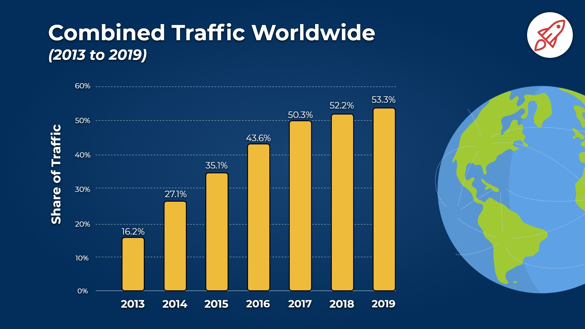
When it comes to mobile banner size and mobile devices, the 2 most popular mobile web banner sizes should be of no surprise to you – numbers 9 and 10 from the list above: the mobile leaderboard and the large mobile banner.
Mobile leaderboard (320×50)
The mobile leaderboard, also known as Smartphone Banner by the Interactive Advertising Bureau (IAB), is one of the most popular banner formats for mobile devices.
Mobile banner ads are similar in proportions to traditional banner ads for desktop, but they’re optimized to fit within the limited viewport of mobile devices. As one of the smaller ad units available, mobile leaderboards can be effective when placed at the bottom of a web page as an overlay/anchor ad.
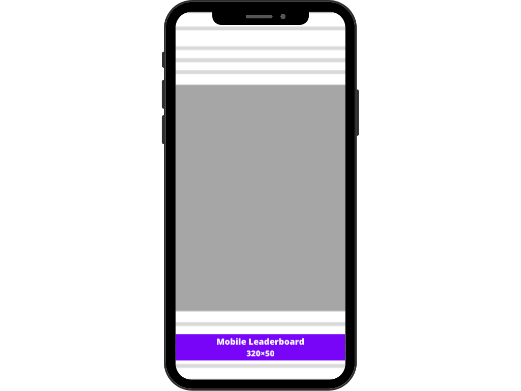
The large mobile banner is a more effective option, so look to see the inventory rise for these mobile formats. It does not have the massive ad inventory that the mobile leaderboard has, but it is the more effective option when it comes to capturing the user’s attention.
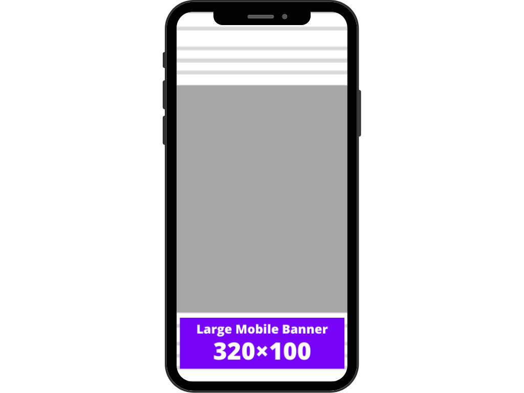
Medium rectangle (300×250)
The medium rectangle is another format that works well on both mobile and desktop. It is the most widely used banner size of all global inventory, with 40% of total reach – hence its popularity.
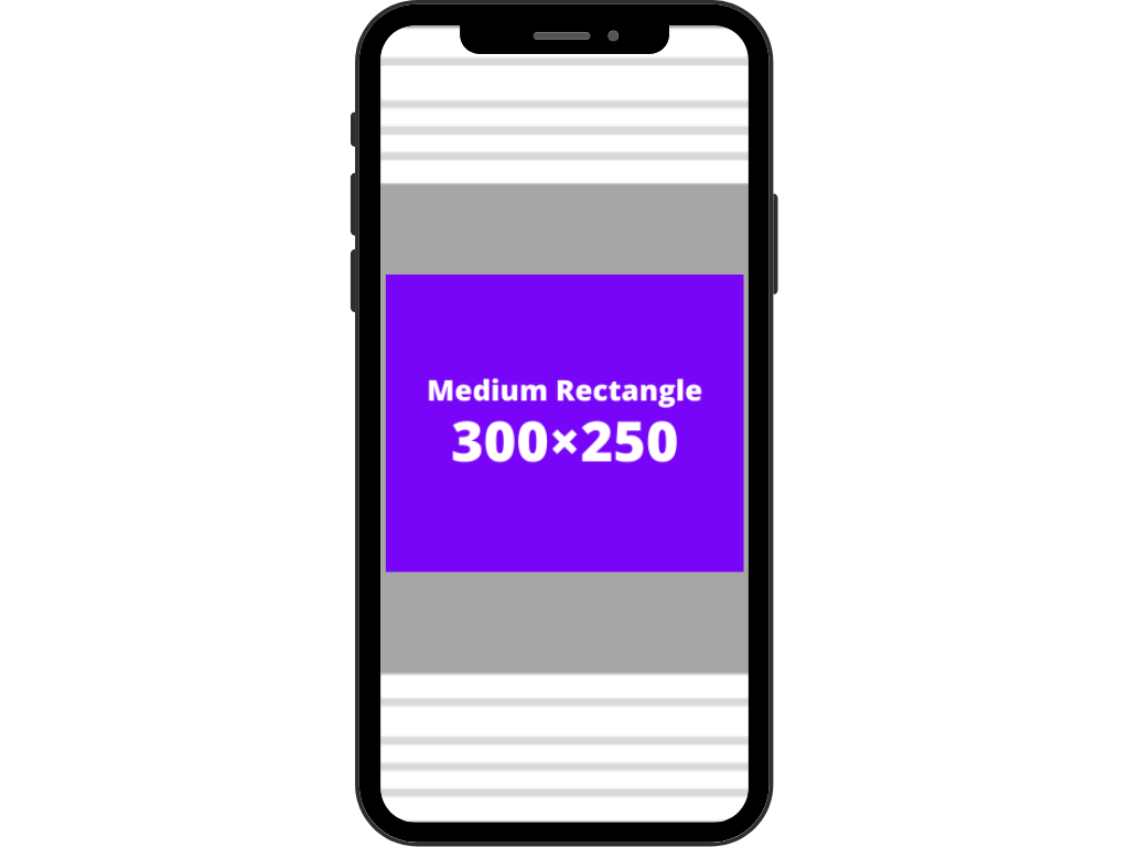
Interstitial/large rectangle ads (336×280)
Interstitial ads are encountered by users as they engage in the standard user experience of a website, app, or mobile game. These ads appear between content, so they place at natural transition points or breaks, such as in between activities or game levels.
They typically take up the full screen of the user’s device may include interactive elements to help drive user engagement, and that is what differentiates them from other banner ads.
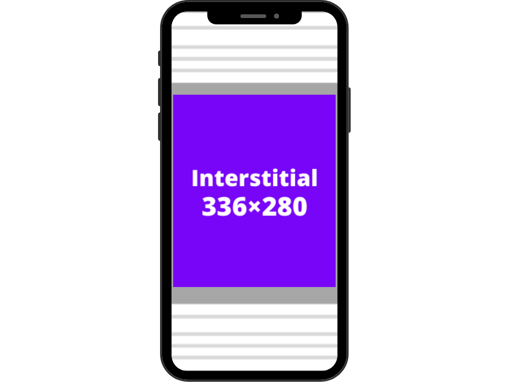
This ad size is known as a Mobile Banner or Smartphone Banner. It is the little brother of the 320×50, which is known as a mobile leaderboard.
A 300×50 ad unit is most commonly used as an ad on mobile phones. They often slide into view as an Anchor Ad on mobile sites, with the ability to close them by sliding back.
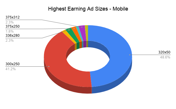
Expectedly, more than 80% of the revenue is from mobile leaderboard (320×50) and medium rectangle (300×250) units. After all, they make up most of the impressions on mobile and have the largest ad inventory
On mobile, the same principle generally applies – larger the size, better the CTR, higher earnings for publishers.
However, there is the exception of user experience. On mobile, there isn’t much ad space to work with. As such, smaller ad sizes like the mobile leaderboard and the large mobile banner work well without completely blocking the user from enjoying the website’s content.
Conclusion
Hopefully, you now have a better understanding of the different display ad sizes available for publishers, the most common banner ad sizes, and what makes the top banner ad sizes have such good performance rates.
There are many options when it comes to displaying banner ads, so in addition to considering ad size, it’s also important to experiment with and test different ad sizes in different placements, and see what works for you.

